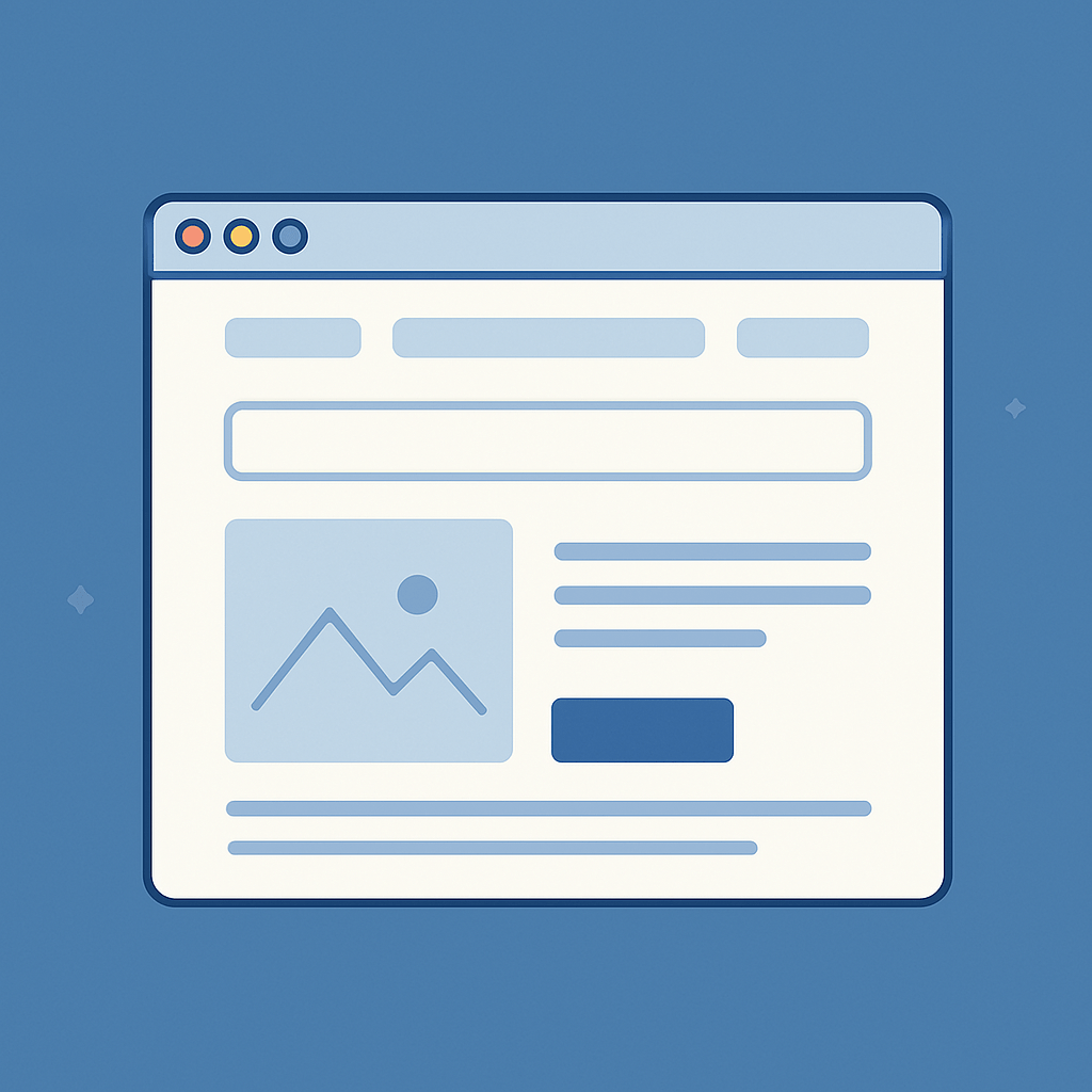
Your homepage isn’t just a landing page—it’s often your first impression, your pitch, and your storefront all in one.
Whether your customers are discovering you through social, search, or referrals, most of them are landing on your homepage before they make a decision. And that means your homepage has one job: move the visitor forward.
In Q2, with traffic up and seasonal campaigns launching, now’s the time to ask: Is your homepage helping people convert—or confusing them?
Here’s how to tell—and what to fix.
Why Homepage Optimization Matters (Especially Now)
Think of your homepage like a retail floor. If it’s cluttered, outdated, or hard to navigate, your visitors won’t stay long—no matter how good your products or services are.
In today’s ecommerce and hybrid retail environment, homepage performance directly impacts:
• Bounce rates
• Conversion rates
• Time on site
• Trust and credibility
And you don’t need a full redesign to improve these metrics. Small, strategic updates can significantly increase engagement and revenue.
At Miso, we help small businesses make intentional updates that turn homepages into high-performing launchpads. Below are the areas we focus on most.
1. Your Hero Section Should Answer “What, Why, and Who”
The top of your homepage should clearly communicate:
- What you offer
- Why it matters
- Who it’s for
If a new visitor lands on your site, they should understand your value in 5 seconds or less—without having to scroll.
What this looks like:
- A strong headline (not just your brand name)
- A supporting sentence that describes your product or service
- A call-to-action (CTA) that guides the next step
Examples:
Not this: “Welcome to [Brand Name]”
Try this instead: “Premium bike gear for everyday riders—built for speed, fit, and value.”
Pair this message with a high-quality, relevant image or video that reinforces your offer. Show the product in use, the environment it’s designed for, or the customer lifestyle it supports.
2. Clear Calls-to-Action (CTAs)
Once a visitor understands what you do, they need to know what to do next.
Every homepage should include:
- A primary CTA in the hero section
- Secondary CTAs in your mid-page content
- A strong footer CTA for email signups or contact
CTAs should be specific and action-oriented:
? “Shop All Commuter Bikes”
? “Book a Free Fitting”
? “Explore Our Loyalty Program”
Avoid vague buttons like “Learn More” or “Click Here” unless paired with context.
3. Show Social Proof Early
Today’s customers rely on reviews, testimonials, and trust signals to decide whether to keep exploring your site—or bounce.
Integrate social proof directly into your homepage layout. This could include:
- Customer testimonials (quote + name/photo if possible)
- Star ratings from product or service reviews
- “As seen in” or partner logos
- Mini case studies or client stories
Social proof should appear above or just below the fold—so customers see it without having to scroll too far.
Bonus: If you’ve received recent press, awards, or endorsements, this is a great place to include them.
4. Keep Navigation Simple and Purposeful
Homepage navigation should be intuitive, not overwhelming.
Audit your top nav menu and ask:
• Are we directing users toward our top-converting categories?
• Are there too many options or dropdowns?
• Does mobile navigation mirror desktop in a clean, usable way?
Focus your nav bar around 4–6 core areas. Add a clear “Contact,” “Shop,” or “Book Now” button that’s easy to find. And make sure your logo links back to the homepage.
For ecommerce brands, a persistent cart and search function are essential. For service-based businesses, make sure your lead-gen CTA (consult, quote, call) is always one click away.
5. Mobile-First Matters More Than Ever
In most industries, over 60% of site traffic is now coming from mobile devices. If your homepage doesn’t load quickly, look good, or scroll smoothly on mobile, you’re losing conversions.
Here’s a quick mobile performance checklist:
- Fonts are legible and don’t require zooming
- Buttons are spaced and sized for thumbs
- Hero sections resize without cutting off text
- Page speed is under 3 seconds
Test your site across devices and browsers, and use tools like Google’s Mobile-Friendly Test to identify any issues.
6. Update It Regularly (Even Slightly)
Your homepage should evolve as your business does. Seasonal campaigns, product launches, and content updates should be reflected here.
Examples of what to update each quarter:
- Hero message and visuals
- Featured products or services
- Lead magnets or downloads
- Promotions or limited-time offers
- Client logos or testimonials
Even subtle updates show that your brand is active, engaged, and current—something both customers and search engines notice.
Final Thought: Don’t Let Your Homepage Be an Afterthought
You spend time crafting social posts, email campaigns, and product pages—but if your homepage isn’t converting, you’re missing a major opportunity.
Small changes to your homepage can create a big difference in how customers engage, trust, and ultimately buy from you.
Need help reviewing your homepage with fresh eyes?
Miso’s Growth Local and Growth Ecommerce services include a full-site audit, homepage conversion check, and actionable recommendations tailored to your goals.
Let’s make sure your homepage is doing its job. Book a quick strategy session with our team and we’ll walk you through what to improve.